01
Overview
Henaket is the official design system for Armenian government digital services, established as the standard under Government Decision 153. I created it at ISAA (Information Systems Agency of Armenia), where I lead a team of three designers in a national digital transformation initiative.
It gives every ministry the same tested library of components, patterns and page templates, with accessibility and interaction standards built in. Designers use it as a Figma library; developers use the React component library.
02
The Problem
Citizens don't experience government as separate ministries — they experience it as one government. When every service looks, behaves and fails differently, people get confused, lose trust and can't complete essential tasks.
At the same time, every ministry was solving navigation, forms, error handling and accessibility on its own. That is duplicated public spending, and accessibility was usually the part that got missed.
03
Goals
What Henaket had to do
- One government, one experience: the same navigation, forms and language in every service, so people learn it once
- Accessible by default: WCAG 2.1 AA built into every component, not added later
- Build once: tested, ready-made parts, so teams spend their budget on the service instead of the interface
- A proven model: learning from GOV.UK, Denmark and Estonia, adapted to Armenian language, context and needs
04
Design Principles
Four principles behind every decision
- Accessible by default — works for keyboard users, screen readers and people with low vision
- Plain language — "Save and continue", not "Submit"; specific errors that tell people what to do next
- Consistent everywhere — the same components and tokens, no one-off custom styles
- Evidence-based — patterns are tested with Armenian citizens before they are approved
05
Foundations
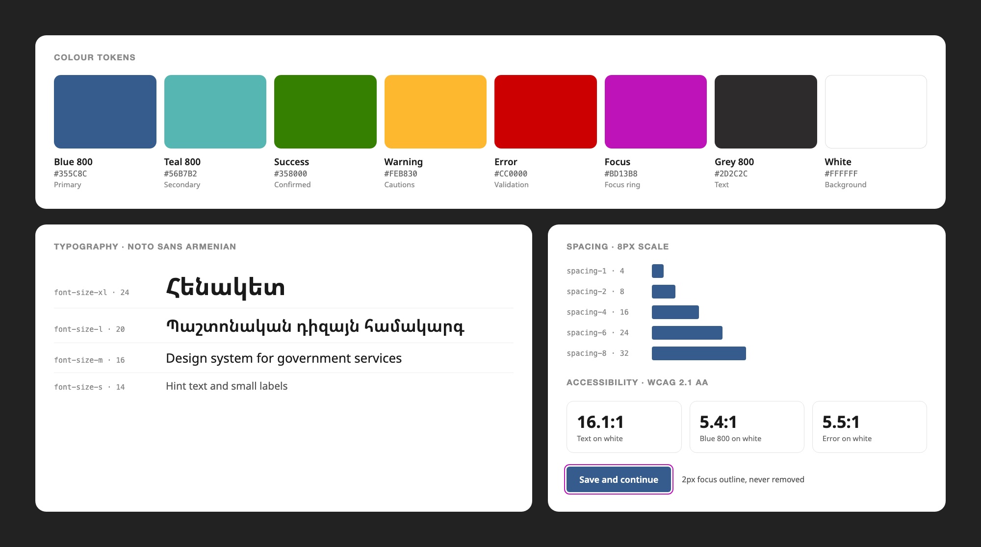
Every visual property is a named design token: color, spacing and typography. A change is made once and flows to every service. Type is set in Noto Sans Armenian, spacing follows an 8px scale, and every color is checked for contrast before it enters the system.
06
Components
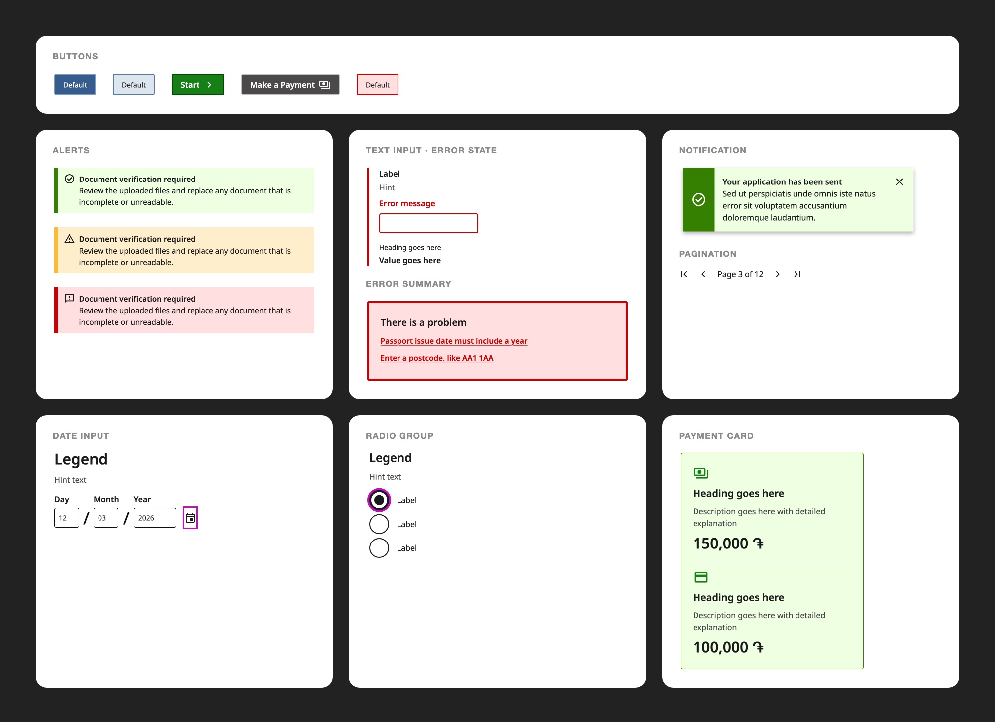
Buttons, inputs, date fields, alerts, error summaries, notifications, cards, tables, pagination and navigation. Each component is designed in every state (default, hover, focus, active, disabled and error), built in React with typed props, and documented with live examples in Storybook.
07
Accessibility
Armenian law requires government digital services to be accessible, and Henaket treats WCAG 2.1 AA as the minimum. Teams inherit compliance from the components instead of rediscovering it on every project.
Built into every component
- Text contrast of at least 4.5:1
- Everything reachable by keyboard, with a visible focus outline that is never removed
- A visible label on every form field — never a placeholder alone
- Error messages that say what went wrong and how to fix it
- Layouts tested at 320px, 768px and 1024px
08
Page Templates
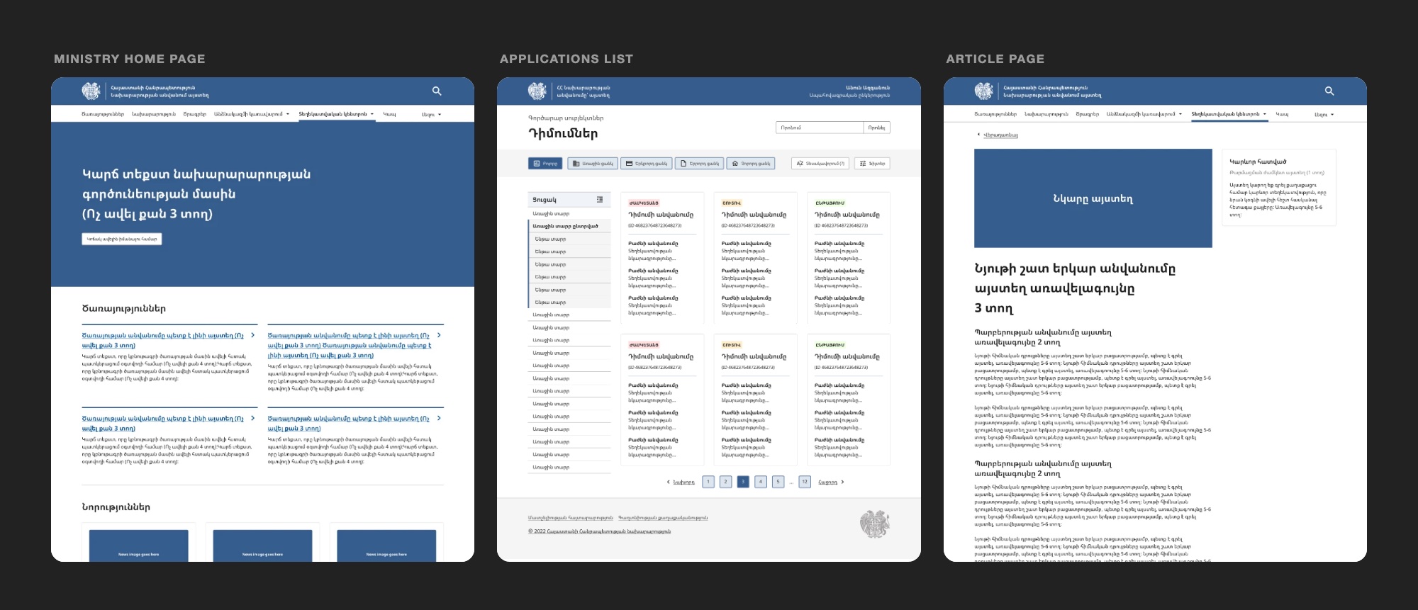
Ready-made page patterns for the most common government flows, from start pages, forms and confirmations to search, detail and dashboard pages. A new service starts from a working, accessible layout instead of a blank canvas. Shown here: a ministry home page, an applications list and an article page, in Armenian.
09
Governance
A standard only works if it applies to everyone. Henaket has three layers with different rules: foundations (tokens, spacing, grid and typography) change only through a system review, core components are used as they are, and patterns allow variants as long as the tokens stay the same.
New components follow a seven-step process: check that nothing existing fits, write a proposal, team review, build in Figma, build in code, document it, and pass a final accessibility audit before release.
10
Impact
Henaket has been adopted by major government agencies, including the Ministry of Internal Affairs, the Ministry of Health and the Rescue Service, and by third-party vendors building public services. Together with UX improvements across eight public services, it contributed to a 34% increase in citizen engagement through better usability and accessibility.